
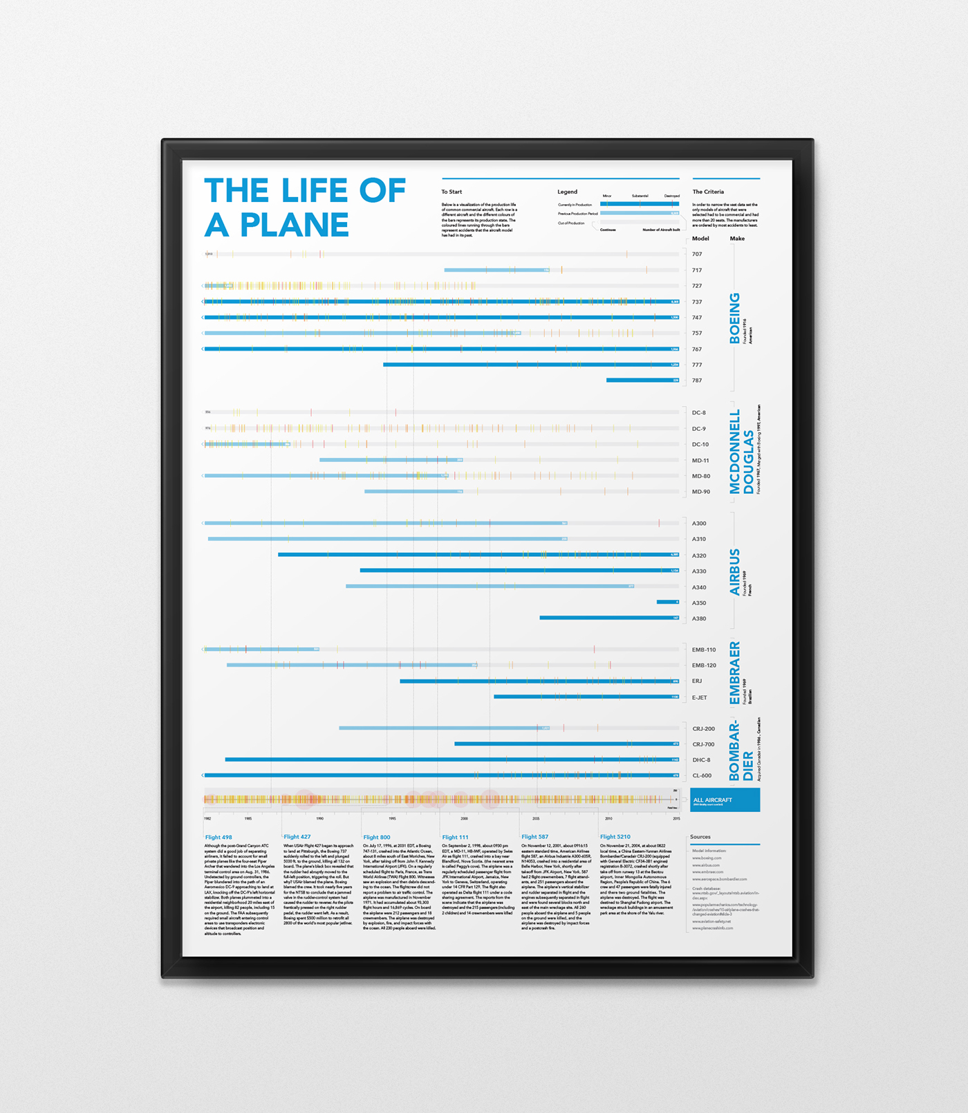
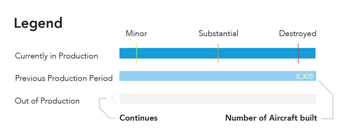
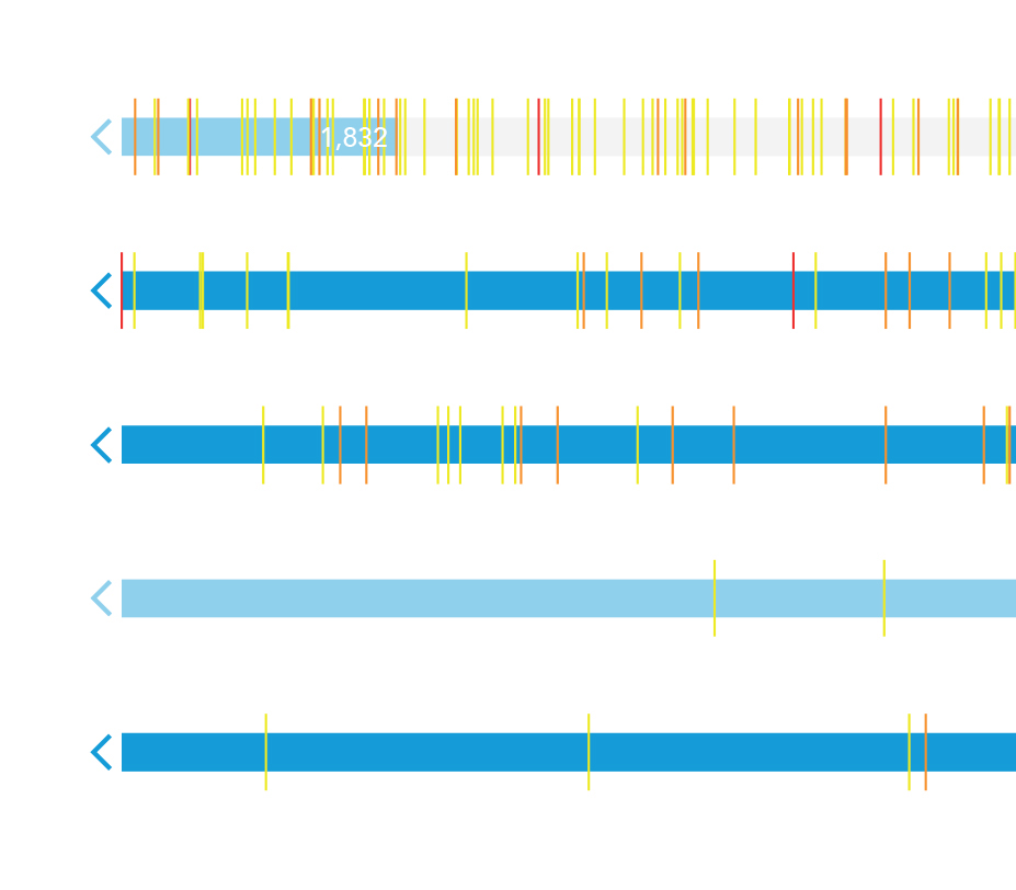
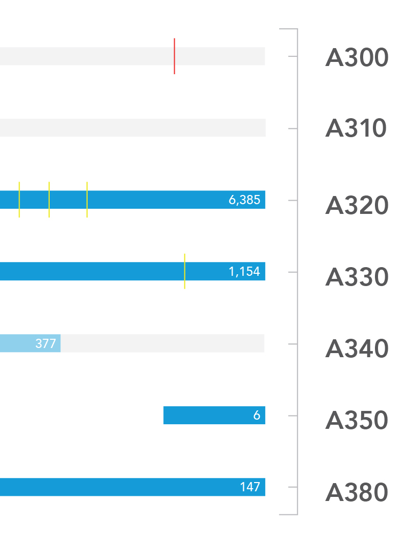
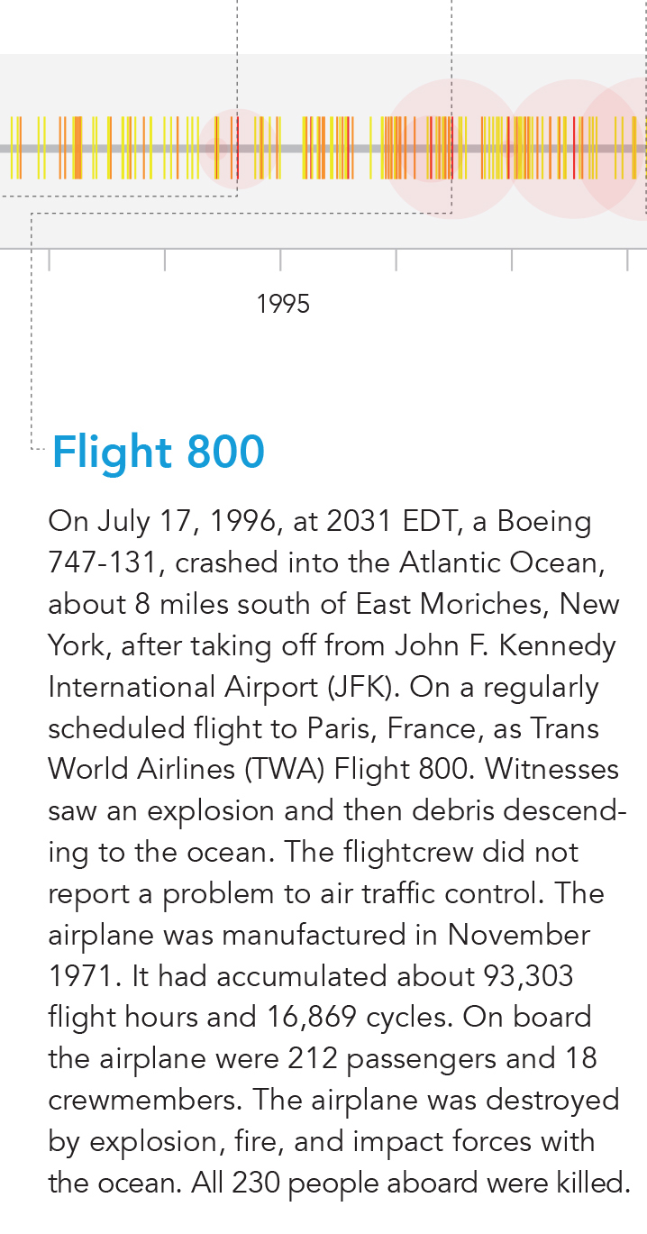
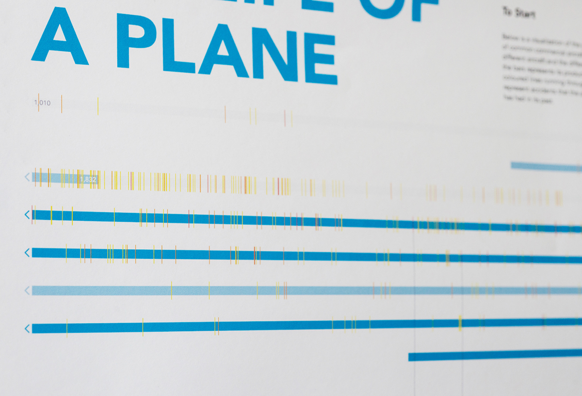
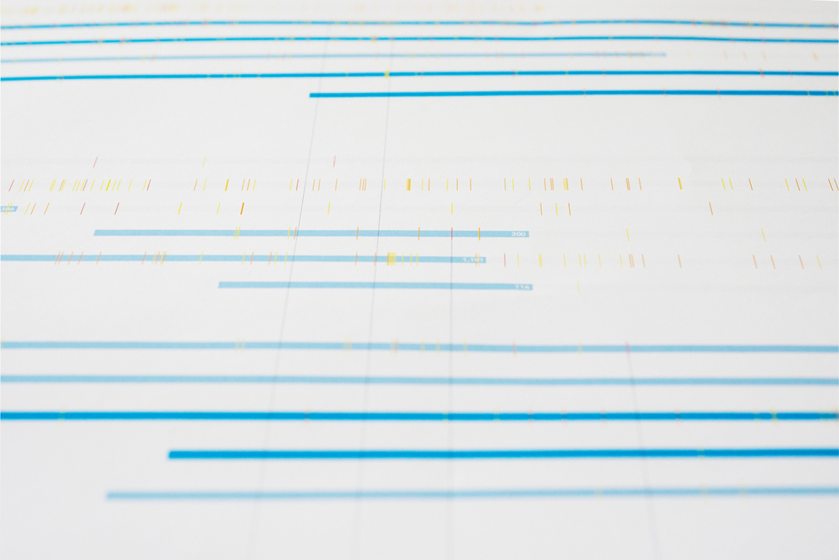


This is creating a timeline of aircraft models and indicating when the model has an accident. This shows interesting relationships about the safety of the models and how they each progressed. All the data is from the NTSB data portal. I used processing to draw each crash and then imported the data into illustrator and created the graphic. The aircraft models selected for this visualization have the most crashes and are seen as common commercial airliners. Each blue row is a different plane model, grouped by its manufacturer. The yellow, orange and red lines running through each represents the severity of the crash on a timeline. I then highlight several key crashes at the bottom that had a significant impact on aviation history.
Thanks!


